LIVING ROOM REFRESH by Jaclyn Kaba

I’m excited to share this room not just because I love the way it looks (even on a very dark and cloudy day like the one we shot in) but because I’ve been working with these clients for quite a while now and we have finally completed a phase of their project. Queue the celebration music!

We started off over a year ago by getting a comprehensive design plan together for their space and then prioritizing where to start. Then covid happened…. There are some built-ins and bathroom remodels on the list still but I think we can all agree that some quick gratification is in order at this point in 2020 so rather then wait for the contractors to finish all of that we decided to jump in and refresh the living room.

Patrick Living Room01.jpg

You’ll see from the before photos at the end of this post that they had an oversized sofa and dark grey walls previously. One of our main goals was to brighten the space while maintaining enough seating and comfort for the family of four.

My suggestion was that we paint the walls a brighter color and opt for a smaller but deep sofa that would allow for a recliner tucked into the corner window area. You can see the design rendering below.

Patrick Living Room11.jpg
Patrick Living Room04.jpg

Some features that may not be obvious but are useful to the clients; the reclining leather chair that’s design supports our client’s healing neck injury and is angled so that it can lay all the way back and still see the TV, the sofa that has reversible cushions and covers that unzip for easy cleaning with two small children, the coffee table that pops up on one side to accommodate a laptop and allow for storage and the super soft rug that is great for rolling around on with the kids. I mention these things because a well designed space is not just about it looking good but about it functioning well for clients in their everyday life. Storage and rounded edges on the coffee table might not matter to a bachelor but they are things that parents consider and I take into account the unique needs of each client when choosing their pieces.

Patrick Living Room02.jpg

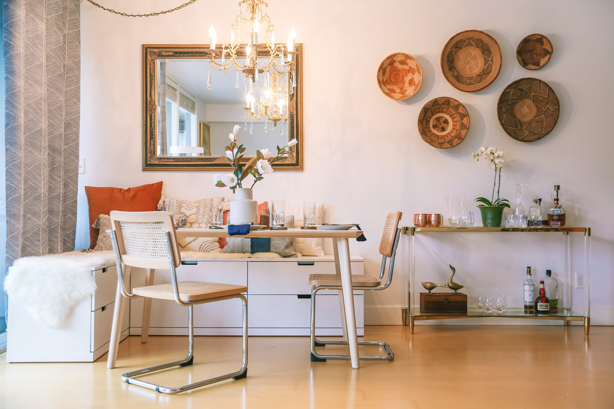
From this angle you can see that we’ve added additional seating for easy conversation when guests are over and updated the fan and sconces over the fireplace. We have plans to eventually update the fireplace surround but the color pallet in here really works with the current one too.

Patrick Living Room03.jpg
Patrick Living Room06.jpg

Custom prints were done with the clients in mind; a sketch of the ocean ( their favorite place to visit as a family), a painting of the mountain ( for a long time snowboarder) and a sketch of a mother and child (as a nod to their faith).

Between the living room and the dining room is this central wall. Its the first thing the clients see when they enter from the garage at the end of the day and a focal wall in the home. It was a great opportunity to highlight favorite images and add a console that allows for additional storage.

Patrick Living Room07.jpg
Patrick Living Room08.jpg

How cute is this family?! I mean I seriously do not know a more deserving couple to have a space that they love. And I’m not just saying that because they are so supportive of my work but because they are truly some of the kindest and most selfless people I know. Love you guys!

Patrick Living Room09.jpg

Here are the before and afters…. Don’t worry we did keep that cute little dog! Everything else got the boot.

Patrick Living Room12.jpg
Patrick Living Room13.jpg
Patrick Living Room10 copy.jpg

If you’re struggling with how to choose pieces for your space, what color to put on the walls or just don’t have the time to pull your room together, I’m happy to help! My goal is to help the everyday individual in any of the areas they may be struggling. My design services are based on how many hours I think it will take to meet your goals and my knowledge and experience means that most often the savings I find you cover my fee. Thank you for reading this far and I look forward to helping you or someone you love soon :)

SPECIAL THANKS: Alex Kelsey for assisting with concept and install

AN OFFICE WITH STORAGE AND CLASS by Jaclyn Kaba

When we started this design this room was full of boxes. It was clear that there was a need for storage but the client also wanted somewhere to display sentimental items. The solution was a combination of open and closed storage.

office01.jpg

We moved the desk (the only piece of furniture the client had) into the center of the room and anchored it with an oversized domed chandelier with elegant brass details. Touches of blue inspired by the collection of plates passed down from the client’s mother was scattered throughout the room and complimented by rich forest greens.

office02.jpg
office04.jpg

The rug was custom sized for the room and adds texture and visual interest, grounding the space without making it heavy.

office03.jpg

plugs were run to electronics inside the lower cabinets where they can easily be accessed but are tucked away when not in use.

office05.jpg
office06.jpg
office07.jpg
office08.jpg
office10.jpg

On one wall we added a console that houses family albums and photo memorabilia. Its clean lines and brass accents are perfect opposite the wall of white built-ins.

office11.jpg

Styled with an antique pottery lamp and gardening books that speak to the client’s love of gardening.

office12.jpg
office13.jpg

Do you have a home office or space that could use some organization or design direction? I’m excited to help. Send me a note and lets start brainstorming :)

A KID ROOM AT GRAM'S by Jaclyn Kaba

Patrick Grandkid's Room 01 01.jpg

Our solution to ensure room to sleep and room to play was a bunk bed positioned on one side of the bedroom and an oh so soft rug that grounds the space and invites the kids to pull out toys and spread out. Another way we kept the floors clear was by adding multiple sconces. A swing arm sconce for Gram when she reads to the kids from her chair and sconces with cord switches so the kids can control them while they curl up with a book in their bunks.

Patrick Grandkid's Room 05 03.jpg

The client had dreamed of a black and white room so that was our jumping off point painting the lower half of the room black and upper part white divided by a chair rail. I believe that kids rooms can be as sophisticated as adult rooms while still being playful. By keeping a neutral color palette and bringing in fun touches in the accessories it will be easy for the kids to grow in and for it to transition back into an adult guest room down many years from now.

*The over head light was switched out to a classic flush mount drum light but it hadn’t arrived before photos.

Patrick Grandkid's Room 06 04.jpg
Patrick Grandkid's Room 08 06.jpg

No fuss bedding and a basket with stuffys and extra pillows sets the scene for overnights. While personal touches like the print of Timberline lodge and lumberjack pennant add personal touches and a nod to the pacific northwest outdoors they all love so much.

Patrick Grandkid's Room 09 07.jpg

The client’s son helped me surprise her by capturing these fun pics of her grandkids which I had blown up and framed on the entry wall. I took them a step further by rotating some of the kids so they looked like they were hanging upside down or popping in from the side is another way I brought in personality while styling with our black and white theme. Gram got watery eyes when she saw it and the kids were so excited to see themselves in the room when they visited!

Patrick Grandkid's Room 04 02.jpg
Patrick Grandkid's Room 10 08.jpg

An Ikea Kalax shelving unit was given legs to complement the corner chair and spice racks were used to highlight the small books for the little ones. Baskets in a dark grey almost blend into the back wall and hide the smaller toys that can look messy.

Patrick Grandkid's Room 11 09.jpg

BATHROOM MAKEOVER by Jaclyn Kaba

BUDGET BATHROOM MAKEOVER

If you’ve been following along then you saw my $400 Kitchen Makeover . The bathroom and its right off of that kitchen. Not an ideal location but old home homes are weird. It was just a matter of time before I continued my makeover into this space. And by time I mean I waited about 4 days after completing the kitchen before jumping into this! This is the only bathroom in the house. My husband and I lived in Manhattan for 7 years together in a 700 sqft apartment with one tiny bathroom so we are used to this scenario. A girl can dream about an on-suite but for not now we are making it work.

IMG_0148.jpg

I’m going to give you a little look at what things looked like before I started. Please excuse the clutter and the mess. I had really never tried making this space cute and sort of blocked it from my mind beyond this point. Things to point out; the super dark purple paint on the upper half of the wall and ceiling, mildew on the ceiling (not visible in this photo thankfully), that before mentioned purple paint bleeding into the faux tile paneling, worn down vinyl flooring, outdated/deteriorating medicine cabinet and equally outdated light fixture.

Snip20200606_5.png


INSPIRATION

I like a dark bathroom. I’ve painted several small bathrooms dark and I like how cozy and sophisticated they feel. I didn’t like how dark the purple was over my head and the white down below was so hard to keep looking clean so I knew I wanted to flip it and go bright up above and dark below. I recently saw a beautiful dark green wainscoting on instagram and knew that would be the color I would try. It needed it to flow with the kitchen so I planned to continue the black and white floors and mixed metals in here complimented by wood details.

IMG_0171.jpg
IMG_0159.jpg

I found the boat painting with the frame at an antique store for $9 and it was the perfect thing to bring all of the colors together in this room. I am so in love with it!

To hide all of our clutter in the cabinet I added mirrored film to the back of the glass panels. The added bonus is that there is now a second mirror in the room and it bounces all the light from the window around the room.

The vase my sis gave me with some beautiful birthday blooms and the brass candlestick is from my mom. My daughter, Iris, and I like to go on walks around the neighborhood together and I pulled these Queen Ann’s lace stems from an overgrown alley.

IMG_0169.jpg

Lets take some time to talk about the paint. Before I could paint I needed to address the mildew. I washed the ceilings and walls down with a solution of water and bleach twice and let it dry before doing the first coat. I also took the fan down and did a thorough cleaning of it to make sure it was working efficiently. I did some research and decided to do Sherwin William’s Duration line for the white because of it’s ability to cover dark colors and built in mildew blocker. The green is Benjamin Moore Backwoods and is the perfect dark green IMO, not too blue or too yellow. They are both done in a semigloss. The white took three coats and the green took two.

IMG_0154.jpg

Are you surprised I added a peg rail?! I might end up with one in every room of the house, lol! But you can’t argue with the practicality and it was a solution to a few problems. 1) there needed to be some clear division between the white and green. 2) Shelf storage! 3) hooks to hang stuff!

I used the standard 1x4” pieces flush against the wall and for the shelf along the window wall but did an 8” piece for the shelf behind the toilet so it was deep enough to hold larger things.

IMG_0098.jpg

This is the same shower curtain I had before but I cut the fringe tassels off of it. The big difference is that I made a new rod out of the same left over copper I made the kitchen hang bar from and raised it up to the ceiling. In a small space going vertical is a great way to make it feel bigger and I think this does a good job of accomplishing that. See the process below for how I did the chain extension. I ordered a pack of chains used for hanging flower baskets off of amazon and switched the S hooks for the easy glide rings I already had.

IMG_1709.jpg
IMG_1711.jpg
IMG_0102.jpg

The light fixture was swapped for a schoolhouse replica I found on Amazon and ties in nicely with the one I used in the kitchen. The mirror had to be large enough to hide the hole from the old medicine cabinet and I love the little shelf the frame creates for bud vases or setting my glasses when I wash my face.

IMG_0115.jpg
IMG_0126 copy.jpg

I went with a semi sheer plaid cafe curtain that was supposed to be grey but pulls a lot of the green from the wall and added just the right amount of print and pattern. I also did a fresh sheet of privacy film on the window behind it. I wanted to make sure I didn’t lose the light in here and I think this was the right way to go.

IMG_0123.jpg

And that’s what our little bathroom looks like now! Only there is a good chance most days there is toothpaste splattered on the mirror, toys laying in the tub and tiny toes standing on that ladder while the kids wash their popsicle stained hands in the sink : )

LINKS:

CHAIN FOR SHOWER CURTAIN

MIRROR

SCHOOLHOUSE SCONCE

CURTAINS

VANITY MIRROR

$400 KITCHEN MAKEOVER by Jaclyn Kaba

KITHCEN MAKEOVER $400.jpg

We are renting so I didn’t want to put very much money into this but I am familiar with a lot of budget friendly materials (which I will be sharing links to!) so I knew that it was more about elbow grease and time. Since we were in quarantine I had a lot of both on my hands. But where to start?

Before we go any further lets take a moment to look back at the before. Its hard to tell from the first photo but to summarize, we were looking at a VERY outdated and dingy kitchen. The laminate floors were stained and worn down to show a yellowy path through high traffic areas and there were holes in the ceiling and chips in the countertop (from before we moved in) The ceiling hadn’t been painted in what seems like half a century and were literally crumbling..

IMG_0986.jpg

INSPIRATION

My personal design style is constantly evolving and lately I’ve been very inspired by classic English details and neutral color pallets. I decided that black, white and grey would be the base colors. Mixed metals and aged wood details would be complimented by white marble and bead-board.

kitchen inspo.jpg

Time to get into the details…..

IMG_9659.jpg

The backsplash is a bead-board wallpaper with two coats of gloss white paint and the countertops were recovered with a 5-layer vinyl faux-marble sticker.

IMG_9662.jpg
IMG_9643.jpg

I had a lot of leftover paint from the DIY HUTCH MAKEOVER so I used that to paint both the cabinets and the molding. The hardware was super cheap from Amazon and has the aged brass feel I was going for. The warm tone looks perfect with the grey don’t you think?!

IMG_9720.jpg

I continued the grey from the cabinets onto the doors and molding but lightened it by 25%. You can have this done for you at the paint store. I had Hope Depot lightened the color I used on the bathroom cabinet in this Lake Oswego Condo by 20% and it turned out perfect but since I wasn’t going to a store during quarantine I did this myself by measuring it out in an old tupperware container and adding 1 part white to 3 parts grey. You wouldn’t be able to tell its 25% lighter when you are in the room but because of how differently the light hits the doors on the opposing walls it was necessary to achieve the same tone from the cabinets on the doors and molding. I love how it accentuates the original details and carries the color all across the room!

The painting of the old woman has been in several rooms of our house but here with this gold frame I think she’s finally found her perfect spot!

IMG_9667.jpg
IMG_9674.jpg
IMG_9682.jpg

Doesn’t the floor looks so awesome next to this black and white stove? It’s part of the reason I chose to do this flooring. I didn’t take a before photo of this side but there used to be a missed matched vent over the stove. It wasn’t actually hooked up to vent out anywhere and the bulb had exploded at one point making it quite a fire hazard so we took it down and I continued the bead board wallpaper behind the stove and added this DIY copper rail. My mom had a bunch of copper pipe she no longer needed from a project so I had my stepdad cut some down for me and ordered some clamps (which I painted gold) and hooks to go with it. I really love all of the mixed metals! The aluminum strainer was my grandmother’s.

IMG_9679.jpg

On the other side of the kitchen is the door to the back porch and our coffee station. Thanks to my sis and her husband for the gift of the beautiful antique library table that brings in more of that vintage charm the room was needing and that element of aged wood. It is just the right height now that I’ve added some old style metal casters.

IMG_9750 copy.jpg
IMG_9736.jpg
IMG_9771.jpg

PROCESS:

I’m sorry that I didn’t post this in real time as I was working on it and at some point I may do individual posts for each step but for now I will summarize for you.

When updating a room I like to work from the top down. If you’ve ever painted a ceiling before you know that there is the potential for splatter and drips. Knowing that all surfaces were going to be recovered in some way I didn’t worry about this. I used a flat on the ceiling (after patching the hole) and a satin on the walls. After painting the ceiling and walls I started on the cabinets. Do yourself a favor and label your doors as you take them off so it is easy to put them back where they go. I also removed all of the hardware to make sure the paint rolled smoothly over the frame. Since we were living through this and would need to still function in the kitchen while this was happening I chose to do one section at a time, tackling the upper cabinets first, then the lowers, then the section around the stove.

IMG_1005.jpg
IMG_1001.jpg
IMG_0999.jpg

Painting your cabinets is not hard its just time consuming! I washed them down with a deglosser first to make sure they were clean and the paint would stick. I gave them two coats of paint using an angled brush to get in all the corners and a 4” foam roller to roll over the doors and then two coats of a General Finish to keep them from chipping and make them washable. When all that was FINALLY done I hung them back up and added the hardware.

IMG_1009.jpg
IMG_1035.jpg

I’m going to skip a step by step of the lighting installation because you should always have a licensed electrician do this kind of work for you but what a difference! I ordered the base from Amazon and the globe was in my mom’s basement no being used. After switching out the light fixture I moved onto the floor while I waited for countertop and backsplash materials to show up. This floor could not be any easier to install! Its self adhesive (easy to pull back up) and can be cut with scissors to get around corners. I stuck it right on top of the old flooring. There have been a few pieces that wanted to pull up at the edges and I’ve gone back with a little super glue and that has worked great to get them to lay flat again. When everything was down I went along the edge with a bead of paintable, waterproof calk to seal it (similar to what I did with the backsplash). If I owned the home I would have probably pulled the baseboards up so the floor continued under them or added a half round piece of molding to hide the edges but this was an inexpensive and easy solution that looks great still.

IMG_1052.jpg

With the ceiling, walls and cabinets done it was finally time to get rid of that chipped, blue/grey laminate counter and backsplash! I probably would have liked to have used real bead board for this but I actually really like this wallpaper option and it has the texture and look of the real thing with the convenience of being able to cut it with a razorblade and has wallpaper paste on the back that’s activated by water! I barely used 1/3 of the roll for this project and at $20 a roll I will definitely be using this again! I used two coats of glossy white paint on it once it had a day to dry completely so it is now waterproof and washable. TIP: Make sure you spackle and sand your surface so that it is smooth before applying. I could have done a better job of this and had to peel back, smooth and the reapply in a couple areas that showed through.

The countertop was not quite as easy. Think of this product like a giant super sticky sticker that you better get just right. Yeah, this was the only part of this project where my husband had to jump in and assist me after I had a complete meltdown mid installation! Some tips for success when attempting this… you absolutely need to remove the sink, have two people, use tons of water to make sure it slides into place, use a blowdryer on low to get it to adhere smoothly to the edges, and don’t freak out if there are a couple little bubbles you just can’t get out. It is still going to look 99% better then it did before!

IMG_1055.jpg
IMG_1058.jpg
IMG_1069.jpg

The lamp and cutting boards were both DIY as well. I had two of the large cutting boards from Ikea already but one was warped and wouldn’t lay flat so I drew a couple shapes on it, drilled a pilot hole and cut them out with a jigsaw. After sanding the edges I stained one with coffee then treated them both with a few layers of coconut oil. I will probably go back and drill a hole in each of the so that I can hang them if I want to.

lamp.jpg

The lamp was a white glass lamp I had in the kid’s room a while back but the internal layer had cracked. I spray painted it with some satin black spray paint and I was surprised to discover the awesome texture that the glass area took on! It has an almost ceramic feel now while the metal parts remained smooth. I switched out the lamp shade with one I had left over from my DIY LAMP projects and I love it in here. I know that you don’t often see lamps in American kitchens but it is very common in Europe and the ambiance in the evening is so beautiful with its soft glow under the cabinets.

*I bet you’re going to be noticing lamps in some of the kitchens from your favorite designers now!

IMG_1270.jpg
IMG_1272.jpg

And tada!! The kitchen is finished and bright and beautiful and cozy and classic and all the things I had hoped it would be and more. But enough about how I feel about it. What do YOU think?!

IMG_9653.jpg

SOURCES & BUDGET BREAKDOWN:

Grey Paint: Swirling Smoke by Behr -on hand

White Paint: Behr Pure white - on hand

Light Fixture: on hand - similar version

General Finishes Top Coat: $74.99

Knobs: $1.87 x 17 = $31.79

Pulls: $6.39 for 10

Vinyl Counter Cover: $89.99

Beadboard Wallpaper: $19.55

Bamboo Window Shade: $31.99

Black Floor Tile: $10.98 x 3 = $32.94

White Floor Tile: $10.98 x 3 = $32.94

Cutting Boards: made with materials on hand

Lamp: made with materials on hand

Paper Towel Holder: $8.99

Paintable Sealant: $4.39

Pipe Brackets: $14.89

Gold hooks: $14.97 for 10

Brass Bar: on hand

Utensil Crock: $24.95

Salt and Pepper Grinder: $12.99

TOTAL SPENT: $400.76

What questions do you have for me? Is there a particular project that you could use a more detailed how-to for? Let me know your thoughts and questions in the comment section below. Thanks!

HUTCH MAKEOVER by Jaclyn Kaba

I started this project before the Corona Virus lockdown so it was the first thing I finished once I was confined to the house. I’d been looking for a while for a hutch for our dining room and there are so many styles out there that it took me a while to decide what I was looking for and then to find something within my budget which was under $100. I’ve seen lots of beautiful new designs out there and I could have purchased something on offer up but I wanted a project and it needed to be something with a curved top to break up all of the straight lines on that wall.

IMG_9220-2x.jpg
IMG_9201-2x.jpg

When I first saw this hutch at a second hand store I was not sold. I knew that I would be fixing it up but it wasn’t as old as I wanted it to be. It had a veneer that I was worried wouldn’t take paint well, no legs and glass shelves. BUT it was $65 and then HALF OFF! It had curves and good hardware already so I wrestled into the back of the car with an associate and brought it home….

HERE IS THE BEFORE…

HERE IS THE BEFORE…

AND AFTER PAINTING THE INSIDE WHITE

AND AFTER PAINTING THE INSIDE WHITE

I picked up a few light greige (grey+beige) paint samples from home depot that afternoon and ultimately decided on Swirling Smoke from Glidden. It is a paint and primer in one, which is great for impatient people like me, and I LOVE this color SO MUCH!!! I got a gallon of it for this project but could have easily used a quart. I’m glad I got the gallon though because I had enough left over for another exciting project I’ll be sharing with you later….

I probably should have sanded before painting but I was lazy and did not. That being said, it is now fully cured and has not chipped at all!  I wanted to make sure all of the hardware stayed clean so I removed all of it along with the doors and hinges before painting. I used a 4” foam roller and angled brush to paint everything. It took two coats. One of the things I noted in my instagram stories on @valondesignstudio was that I do not tape when doing glass, I prefer to come back and clean up with a razor blade. Especially when you are dealing with glass like this that bevels. Thats just my personal approach.

The inside I painted the same white that I used on the walls in the dining room because it helps it feel more airy and almost built-in in the room.

IMG_0647.jpg
IMG_9208-2x.jpg
IMG_9218-2.jpg

How pretty does that hardware look with the new paint?! I also switched out the shelves for 3/4” plywood that I painted in the same white. I think it makes it look much more of the 1920’s era of the house and less 1960’s. I had them cut down for me at Hope Depot so I didn’t have to worry about the mess. If you aren’t aware, they will cut down just about anything for you to the size you need for free!

I’m on the hunt for a great set of hand made ceramic dishes for special occasions that will live in here but for now my sis is letting me store her Mikasa set and I do love the color on the white.

IMG_9215-2 copy.jpg

I added these legs to the hutch to give it a little more height and to give it some visual space. Having visibility under the hutch makes it feel lighter and like it takes up less room that it truly does in the room.

To attach them I first removed the small metal footings with a flat head screw driver and then drilled three holes in to each leg being careful to make the hole under the large ridge so that it would be less visible. I counter sank each hole so that the screw head would be hidden and then filled with wood putty and sanded once it was dry. And walla!

IMG_9224-2 copy.jpg
IMG_0619.jpg
IMG_0621.jpg
IMG_0622.jpg
IMG_0623.jpg
IMG_0628.jpg
IMG_9200-2x.jpg

So here’s the breakdown…. Cabinet $32.50 + Grey Paint $35.98 + Spindle Legs $17.69 + shelves $8.50 = $94.67!!!

Thanks for taking a look! I’d love to hear your comments and answer any of your questions below and if you’re looking for something specific for your space let me know how I can help.

PLAYROOM UPDATE WITH PEG RAIL by Jaclyn Kaba

When I started this update two weeks ago it was on a long weekend… little did I know just how LONG that weekend would end up being as we entered into a shelter-in-place situation.

Playrooms can be very overwhelming. I get anxiety around holidays and birthdays because I’m unsure what the kids are going to be getting and if I’ll have a spot for it lol! Fortunately our family knows this about me and often ask what they might need/want and if they don’t they have great taste and I haven’t had to make too many adjustments. Thanks fam!

If you’ve seen other elements of my home you’ll know that I lean towards a minimal, shaker/scandinavian aesthetic with lots of neutral colors. Just because this is a room for kids doesn’t mean I treated it any differently. There are definitely nods to whimsy and playful moments I still wanted it to feel like it flows with the rest of the house. I love simple wood toys and things that will stand the test of time while mixing in some of that good ol’ nostalgia of the plastic toys we all grew up with. Archer has been obsessed with batman for three years and that stuff only comes in plastic!

IMG_9379 copy.jpg

A little backstory… This room is in the middle of the main level of our home, directly off the dining room. It was originally a guest bedroom with a queen bed but as Archer got older and we needed more room for his toys we decided to switch to a twin size bed with trundle. It lived on the right side of the room where the tent and desk are now. (Sorry I didn’t snap before pics on this!) It was functional but with two children, an expanding toy collection and need for more usable space we decided to get rid of the bed. We have overnight guests about 1-2wks out of the year. My solution, so as not to be putting them on a blow up mattress, was to store the trundle and mattress in the closet so we could easily pull them out when we need them.

The room was already painted this color so I left it as is but am considering bringing the white from the ceiling down to the picture molding… too much to take on at the moment. Fortunately I’ve used this color upstair as well and had it in a gloss so I painted the peg rail and shelf in the glass version. I chose not to paint it white like the other molding because there were already so many other thick white molding elements and I didn’t want to break up the room so much. I kept the pegs natural to tie into all of the other natural wood toys in the room and the natural pegs in the dining room.

IMG_9382.jpg
IMG_9465.jpg

BENCH: The bench was made from this shelving unit from IKEA. Before this I had it behind the door but thought it would be better used as a window bench and book storage. I cut it down by removing one of the box areas so that it would fit under the window and added simple 2x2 feet. I chose cafe curtains because I didn’t want to lose space by doing traditional curtains that went all the way to the floor on either side of the bench and because I think its a really cute detail in a play room. These are from Target.

SHEEPSKINS: I already had the sheepskins and bird pillow. The gingham lumbar pillows came in a set of 2.

TENT: The tent was super easy to put up and the kids love to cuddle up in it together. I ended up using a canvas drop cloth I had to layer up as a mat for them because floor pillows are expensive! However, I did find that by looking for dog beds it cut the cost in half! I am still considering getting them this one

RUG: If you have kids or are simple afraid of having a rug in a high traffic area or somewhere it could get dirty like a dining room them I highly recommend you use an outdoor rug in that space.  If something spills its no big deal since you can literally hose it off! Target has some really great designs right now. You can find the one I used here.

IMG_9432.jpg

I intentionally kept the larger/heavier things on the inside walls so that they aren’t the first thing you see when you walk in. These shelves can get pretty messy and visually overwhelming and it is nice to tuck the clutter back in the corner. You can see from the photo that we added a second box shelving unit on top of the one we had to get twice as much storage on that wall. You can buy the same size unit without having to double up here. The Kidcraft kitchen was a gift from Grandma and Papa last Christmas and all of the food and accessories are from Melissa & Doug except for the pans from Ikea.

IMG_9414.jpg
IMG_9423.jpg

I was so excited when I recently found the little vintage picnic basket with the matching lining for the kitchen! Iris loves to put her ice cream cones in it and carry it around :)

Other vintage items are displayed on top or the large shelving. Both of the globes were found at Goodwill and the chair we borrowed from Grandma’s schoolhouse. Baskets are a must for all the stuff you don’t want to see. I also have this shelving unit behind the door for all of Archer’s legos and building materials. I like to breakdown the lego boxes and ziplock all of the pieces and the instructions into their own bags to keep them together. We will see how long that lasts lol!

IMG_9419.jpg
IMG_9471.jpg

DIY PAPER ROLL HOLDER

With some leftover materials I created a way to mount the paper roll over their desk. I used cutoff from the peg rail for the flat pieces, old dirty 2x2’s I sanded clean and used the same paddle bit I used for the pegs to drill holes for the pipe I had in the basement. Archer helped me :)

IMG_9398.jpg
IMG_9404.jpg
IMG_0810.jpg
IMG_0815.jpg

Its important for me in my home and every design I do to mix modern and vintage elements. I love the way the vintage kids chairs look with the simple modern desk and how the original artwork makes the room feel curated. I originally had the lamp on the table and ended up taking it apart and adding a different shade in order to hang it from the peg above the desk.

PEGRAIL WITH SHELF

If you like to change things up a lot like me then installing a peg rail with shelf is a great way to go! It only cost me $27! I knew that I wanted to find a way to bring more storage and display potential to the room and am still in love with the peg rail I did in my dining room so I decided to install a similar one in their room across two walls and add a shelf above it. I went with basic 1x4s from home depot and these pegs that come in a pack of 25. The installation is ridiculously easy. I like mine to be just over head height around 70”. Installed the flat board first then screwed the shelf on top of that and used a paddle bit to make the holes for the tenons of the pegs. I have also seen people install the pegs before putting the rail up so that they can add a screw from the back but I knew that I wasn’t going to be hanging anything super heavy of of them so I opted for a snug fit with some wood glue and let them dry overnight before hanging anything from them. In the dining room I used these pegs that screw in and they worked out great but are twice as expensive.

IMG_9459.jpg
IMG_9438.jpg
IMG_9457.jpg

How is your playroom looking/functioning? Are there things you think you could try differently in there? I’d love to hear your comments and questions below!


7 THINGS FOR YOUR HOME OFFICE by Jaclyn Kaba

It was day five of quarantine when I realized that trying to work on my computer at the dining table was not going to cut it anymore. Between the kids trying to eat next to me and the constant interruptions I just wasn’t getting anything done. So I took matters into my own hands and created a work station while considering 7 key things. Some of which will be obvious and one very important thing you may not have considered.

IMG_9131-2.jpg
  1. LOCATION

    It is crucial to find a spot where you won’t constantly be distracted. Look for low traffic areas, preferably without a TV. Do you have a closet you’re not using efficiently, I window nook that you could shave off a few feet from, the end of a hallway?

    We do have an office but for all intents and purposes it is my husband’s office and art room and I really needed somewhere I could have my things and my sanity! Without another room to designate as my own office I started looking around for a nook to carve out. The upper level of our home is where we all sleep. Our bed is in the main area and then our kids share the back bedroom.

IMG_9074-2.jpg

2. LIGHTING

I can’t stress the importance of lighting enough. Studies have shown that having exposure to natural light has a wide range of health benefits, including increased productivity. Natural light helps constrict your pupils, which benefits the function and reading ability of your eyes. The reality is that our eyes are not meant to function with artificial light, but rather under full-spectrum lighting. Having exposure to natural light will help boost your productivity and improve your vision. If you can’t position yourself in a bright space consider investing in a full spectrum light bulb . The light upstairs is so beautiful and inspiring and makes me really happy! I’m a visual person so obviously that is super important to me and effects my mood and motivation.

IMG_9151-2 copy.jpg

3. COLOR

I am easily distracted by color and when I am working on a design I need to be able to keep my work space a blank canvas. For me having mostly white works. Other colors to consider are greens and blues. Both of these colors are very relaxing and comforting. If you’re not looking to repaint there are other quick ways to bring in color, for instance green plants or a dark blue chair.

TIP: One of my favorite things to do this time of year is cut some budding branches and put them in a vase. Most often they will continue to grow and bloom for weeks and it is so awesome to watch the arrangement evolve. Plus its free!

IMG_9106-2.jpg

4. SEATING

I ultimately swapped out the chair in the photos for one with a little more cushion but you may even consider not having a chair at all and creating a bar height standing desk (Love the idea of doing a single board in-between window casing to create this!), maybe you want to try a balance ball or swivel stool. Whatever helps you stay comfortable and engaged in your work I say do it!

5. ORGANIZATION

Studies have shown that the average person spends a week each year looking for missed papers. Yep, you read that right, a whole week! Everyone’s needs will be different but it’s important to consider this as you design your space. If you need to have access to files use a file cabinet as the legs of your table similar to what I did. Use shelves above your desk to keep clutter off of the floor while keeping things in arms reach.

TIP: Personalization is important but shouldn’t get in the way. If you like to have pictures on your desk consider hanging them on the wall to free up valuable space.

If I’d had the chance to go out and do this from scratch with all the materials available to me I would have wanted to do a simple reclaimed wood design but in doing my part to flatten the curve and stay at home I started an inventory of everything I had at home that I could use to make it work. I found one nightstand and one board that I thought might just do the job. Ideally I would have liked to have had two file cabinets or matching night stands but again, working with what I’ve got…

Specifications of my design: The board is 18” x 7’2”. The height was determined by the nightstand and with the thickness of the extra board it is 26” high. To ensure the board was supported enough I mounted a 2x2 to the wall on the left and added two brackets underneath. I happened to have these both on hand I just had to paint them white. The board was precut so I didn’t have the option of stretching it the entire length of the pony wall and I was ok with that because it left room for the curtain to tuck back still. I’m currently using the basket to store a laptop case and camera bag. Large things that wouldn’t typically fit in the drawers but look messy when they are out.

TIP: Love these brackets that allow your desk to fold down when not in use.

Below is a little before and after comparison for you. For some perspective of layout, the pony wall hides the stairs and directly opposite the desk is our bed.

Snip20200323_3.png

BEFORE

IMG_9130-2 copy.jpg

6. TECHNOLOGY

What do you need in order to be efficient? High speed internet, surge protector with multiple plugins, printer, scanner, fax, shredder? Now take all of the things you listed and decide what needs to be visible and what can be hidden away. Can your power strip be mounted to the underside of your desk to hide wires? Can you tuck your printer/scanner or shredder into a drawer so that it is easily accessible but not sitting out? Keeping as many things hidden but conveniently located will keep not only your desk but your mind clear as you are working. If fact, 57% of people think that one's work directly correlates with the tidiness of their office. That means that if your office is messy, your work is likely to be messy as well.

TIP: Muli function and wireless units like this help minimize the amount of space needed and are easily tucked away without having to deal with cords.

7. BOUNDARIES

The last thing to consider is not part of the design but still crucial to your success, especially if you are working from home with little ones like I am! Determine and communicate what your expectations are for your work space and during the time that you are working. My family knows that they don’t touch or move anything from my work space. If they need a pen or a charger there are others located in the common areas of the house. I wake an hour before everyone to get my day started and work for at least two hours in the afternoon while our little one naps. Having these set boundaries and designated work times allows me to be more present for them when I’m not working and ensures I have what I need and won’t be distracted.


IMG_9109-2 copy.jpg

So what do you think?! Are you ready to revamp your work space or carve something out from scratch? Don’t be discouraged by stores being shut down. I have a wealth of online knowledge and recently furnished an entire condo 90% online. Leave me comments and questions below and reach out through my contact page if you’d like a FaceTime Consultation :)

DIY AGED LAMP TUTORIAL by Jaclyn Kaba

I have been seeing a lot of ceramic lamps out there and I LOVE the look of them!  They can be VERY expensive though. Some of my favorite accounts on Instagram have a few examples and I ended up following the tutorial from @carpendaughter. The lamp makeover she did is so beautiful! I’m always looking for a good DIY project so I started looking at thrift stores for some that I could customize.

One day while I was at goodwill I came across these two which had the texture and shape that I was looking for and bought them for $7.99 and $6.99. For this tutorial I think it is best to have some layers or crevices in your lamp or vase to ensure that the lime or dirt has a place to collect. We’ll talk more about that later!

IMG_0471.jpg

I already had some black spray paint on hand but I wanted something that looked a little more like clay so I picked up Smokey Beige by Rust-oleum and the garden lime @carpendaughter used at Home Depot. I like to use Rust-oleum’s 2X ultra paint and primer because I think it sticks better and who doesn’t like skipping a step and not having to prime, am I right?! I taped off all of the brass and cord I didn’t want painted and gave them each a couple good coats.

IMG_0461.jpg

I was pretty happy with how they looked just having a clean coat of paint on them so I was optimistic at this point that the lime wash was only going to make them look better…. And it did! Please pay no mind to my garage overflowing with cardboard. My last design project required that I had a lot of stuff sent to my place and I haven’t been able to fit it all in my recycling bin yet. Anyways, its been coming in pretty handy for all my DIY projects so its not all bad. I wouldn’t ask my husband about it though lol! Also the AFTER picture of the lamps after the lime wash was after the first go so that black lamp got sanded and retreated for a more consistent finish.

Now back to the process… after they were dry I mixed up the garden lime and water until it was somewhat like pancake batter in an old jar. Not too thick but not too runny. About a 1 to 1 ratio. (If you don’t have any garden lime on hand I have also seen some tutorials using just dirt that turned out great as well.) Then I painted it on and let it dry. I waited about 10 minutes and then used dry paper towels to wipe it off, being careful not to wipe it off in the creases. I went against the grooves in order to make sure that I was wiping the stuff off of the top surface. So with both I wiped them vertically. There was some trial and error involved so I ended up adding a second layer of lime to the black lamp and repeating the process after I wiped a little too much off and left some spots streaky.

IMG_0467.jpg
IMG_0468.jpg

I was very excited with how they both turned out!!! Now comes the tricky part…. finding the perfect lamp shade. Do not take this step lightly! I bought a few at Ikea. If you didn’t know, their new line has adjustable bases that allow you to flip it for sconces and chandeliers (SO COOL!) I used one of them in the kid’s room refresh that I will be sharing with you soon…but back to this tutorial. Target has a great selection of dome shades and Amazon is where I found the more angles styled shades. I ended up trying two different shades on the smaller cream lamp before finding the right one and, not kidding, FIVE different shades on the black one before I was satisfied lol! No secret that I am a bit of a perfectionist but I really think the shade makes or breaks the light.

ACS_0466.jpg
IMG_0751.jpg

And here they are! What do you think?!!! Is this something that you would try? If I started making more of them would you be interested in purchasing one? I’d love your feedback below :)


LAKE OSWEGO CONDO by Jaclyn Kaba

IMG_8435xx copy.jpg

I am SO RIDICULOUSLY excited to be sharing this finally!!! I hope you’ll scroll all the way down and look at the before and after comparisons because when I say we’ve changed A LOT since we started (just 6ks ago!) it won’t cover just how different this space really is. Ok I'm jumping ahead so lets start at the beginning, Nov 7th to be exact. I get a call from Della that was somewhat urgent. Her dream is to downsize to a condo on Lake Oswego and knows it can be Terry’s dream too but he is less than excited about the said condo they’re supposed to be moving into in just three weeks. I meet Della at the condo to assess just what we are working with. It is offered as fully furnished and move in ready… but we realize we really want to start fresh. Anyway, our meeting quickly changes into a discussion about having everything removed and permission to repaint and change the carpet, which will now all need to happen within the three days between their current house closing and moving in. If that wasn’t challenging enough, the Shanley’s already have holiday guest scheduled to arrive and will have just 8 days in total to completely transform and furnish everything.

Planning began when I reached the parking lot and my mental wheels start turning. Once home I start a Pinterest board and create a presentation to share with them my vision of the space based on our discussion. Modern + Nautical + Glam. Once approved I’m in overdrive because we’ve got one shot at this people! No time to spend months dilly-dallying on making decisions and him-hawing on the perfect pieces. Things must be accurately scaled, practical for everyday use and multifunctional because they are going form 3k sqft to 1k sqft. So you’re wondering if we pulled it off? Well keep scrolling to find out :)

IMG_8328.jpg
IMG_8252x.jpg

The banquet was inspired by a fellow Pinterest user that did this in her own home and I knew it was a perfect solution for their space. It has a ton of storage and keeps the table tucked against the wall so there is a clear path to the deck. The chairs were chosen to tie into other cane details throughout the house and their modern design takes up little visual space. The chandelier was Della’s mom’s. We converted it to a plug in and swagged it over the dining table to anchor it and add sparkle. It pairs nicely with the lucite and brass credenza we added a lower shelf to in order to make it a more functional bar.

IMG_8373.jpg

The paintings above were commissioned by Terry for Della and hold a lot of sentimental value. They are the first thing you see as you come down the hall from the front doors.

IMG_8280.jpg

Honestly I’m still kicking myself for not keeping those antique African baskets and brass birds for my house because I fell in love with them but that’s when you know its good, when its hard too let go.

IMG_8511.jpg

Oh hi! It’s me! Just doin my styling thing, lol. Learn more about me and how I got started on my bio.

IMG_8655.jpg

This room is what I would compare to a design trust fall. Originally designated as the master bedroom, I convinced them that it would be best used as a multifunctional space. Della works from home and when you’ve got a lake view it would have been quite a shame to deny her that from her desk. Terry loves to read. Knowing first hand what its like to share a small living space with your beau, having lived in a 700sqft Manhattan apt with mine for 7yrs, I knew the value of having two living spaces. The sofa matches the one in the living room so they can pair in a larger space down the road but this one is a sleeper sofa to accommodate guests.

IMG_8679.jpg
IMG_8615.jpg

We added a large book shelf across from the sofa to house Terry’s books and special items to remind them of family and a life well lived.

IMG_8628.jpg
IMG_8636.jpg
IMG_8869-2.jpg
IMG_8692x.jpg

Never underestimate the power of paint. With a little extra material from our bedroom wall installation we added this chair rail to the half bath off the office/library and with a LOT of time cutting in with a small paint brush we made this small bath feel much bigger and more luxurious.

IMG_8764.jpg

We used paint once again to clean up the main bathroom. A light grey for the cabinet and white for the walls. We switched out the mirror and drawer pulls and if you haven’t heard about peel-and-stick tiles you should check them out. They are a great option for a rental because they can be heated to be removed and are actual real marble.

IMG_8927-3x.jpg

If you only look at one before and after comparison it should be this one! I was a little bit stumped when I saw this room because it had a hot orange grass paper wall that I couldn’t take down or paint. My solution was to cover it with 1/4 plywood and add this pretty 1x3” feature wall.

IMG_8932-2x.jpg
IMG_8733.jpg
IMG_8756.jpg

Just because you are downsizing doesn’t mean you have to sacrifice luxury. This spare room is a perfect example of that. We were careful to add storage throughout the entire house so that this room could be designated as a walk in closet. I custom designed the closets to fit their needs and added a beautiful beaded chandelier above a storage ottoman perfect for sitting on to kick your shoes off at the end of the day. For Della, we used an open wall for a makeup vanity.

IMG_8850-2.jpg
IMG_8795x.jpg
IMG_8950-2.jpg

And the reason we are here… access to the lake from this beautiful deck! Careful planning went into the layout and scale of the pieces. The bar height table is at rail height so you look straight onto the lake when dining and can be paired with two matching stools from the kitchen island to seat 4. When the heater over the sofa is on, the candles are lit and the string lights are powered up it is almost impossible to leave :)

IMG_8477.jpg
IMG_8488.jpg
IMG_9000-2x.jpg
IMG_8977-2.jpg
cover copy.jpg
B+Amainroom.jpg
IMG_8435xx copyAFTER.jpg
IMG_8391BEFORE.jpg
IMG_8418after.jpg
IMG_8393before.jpg
IMG_8655AFTER.jpg
B+Ahalfbath.jpg
B+Amaster.jpg
B+Awardrobe.jpg
B+Amainbath.jpg
B+Aentry copy.jpg
B+Adeck2.jpg